Domaine Clavel
- Branding & print
Communication strategy differentiated
Project
Because it is sometimes important to know how to stand out from the crowd, it is also necessary to have the courage to go for a simple, punchy image. And this was the challenge facing Domaine Clavel.
In fact, Clavels in occitan actually means nails and so the message adopted needed to be worthy of these nails, which hark back to the family history of the Domaine. So the Clavels identity drew its inspiration from a simple nail and it was on the basis of this that we put together the whole range of communication tools and ... believe me ... it has nailed home the message more than once!
Result
Visual identity
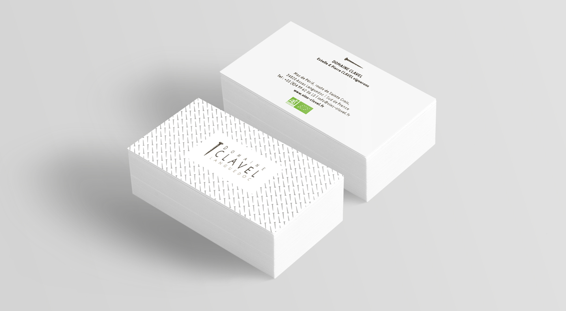
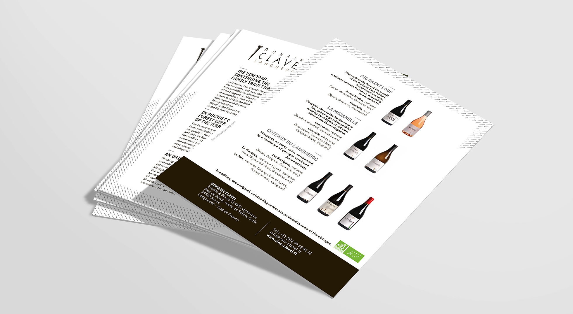
Design and creation of a visual identity, starting with a simple nail which has become the basic pictogram of Clavel communication aids.
Publishing and printing
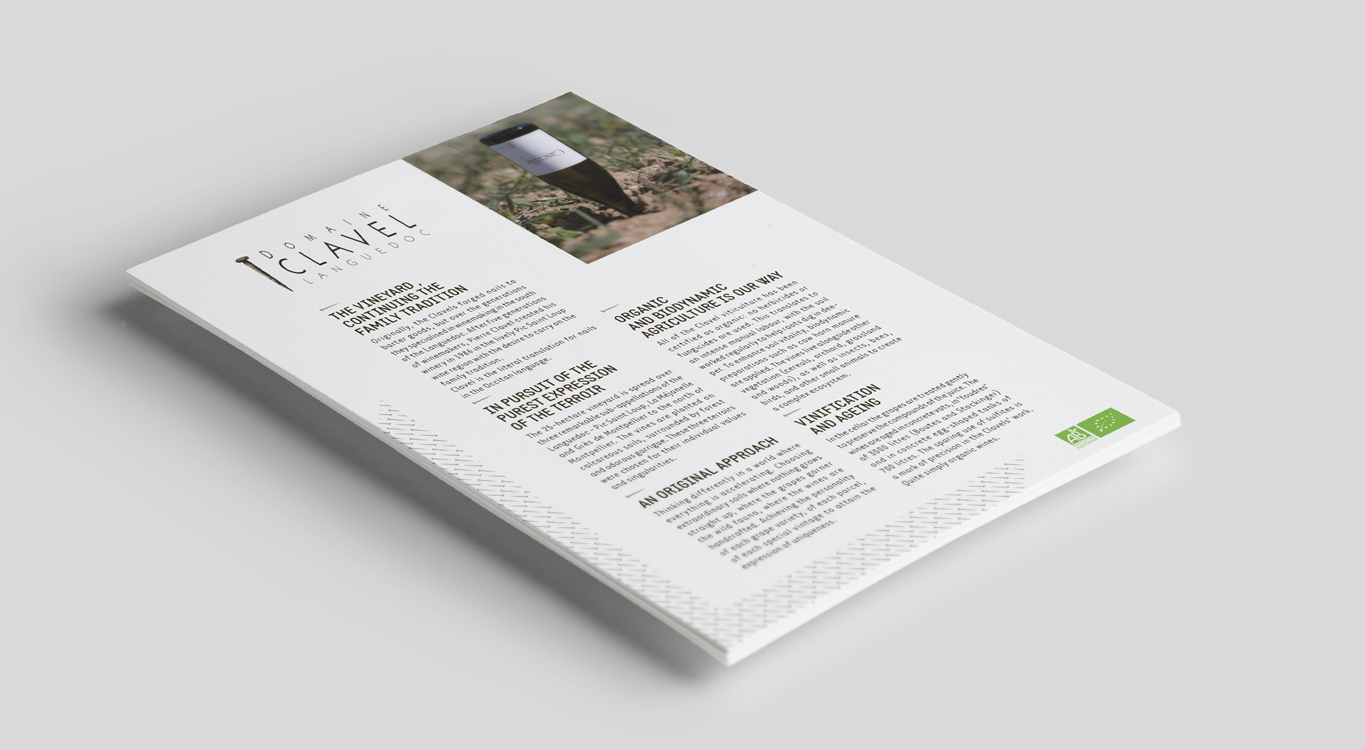
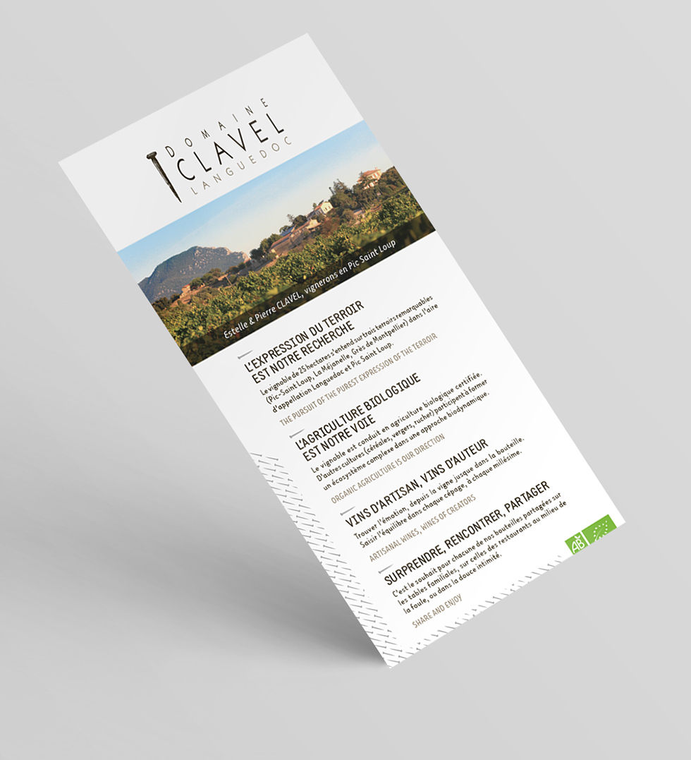
Design of paper communication aids, in line with the graphic charter.
